Friday, 3 June 2011

Digital engineered prints

Advanced textiles result in lots of digital printing as seen on the catwalks of designers such as Emilio Pucci, Versace, Alexander McQueen and Basso & Brooke. Nowadays the fashion industry have moved from handmade screen printing to digitally tailored clothing.


Image from http://www.style.com/fashionshows/complete/F2010RTW-BASSOB


The patterns are scanned on to the computer, then print designs are applied onto the pieces. After that, the marker of the garments are placed well so that the prints are digitalised to fit the pattern pieces and therefore to show the continuity of the print design around the body without breaking by the garment's seams.
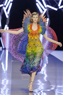

Image from http://www.style.com/fashionshows/complete/S2008RTW-AMCQUEEN?page=2
This placement print costs a lot more and time consuming so it's very expensive to produce garments with engineered prints.


Thursday, 2 June 2011

Think positive

It was very nice to have Emilie from Think positive printing come over to show us wonderful samples of exquisite prints on different types of fabrics. I had a chance to look at how the colours change when it's printed on silk organza compare to one on silk crepe and other fabrics and notice the differences.


There’s also a colour chart with different reference colour codes on jersey fabrics to make it easier to identify the wanted colours on that type of jersey, and so do other types of fabrics etc…


Tuesday, 24 May 2011

Beads sourcing


Since beads are one of interesting details in my collection, selecting high quality beads does matter. I visited Bead house where they sell thousands of different kinds of beautiful beads including Swarovski crystals in a variety of shapes and sizes. Though the prices are not cheap if calculating the number of beads are used in one garment, for sure these beads will add luxury to my garments.


Silk!!

From the discussion with my supervisor, my collection will be a ‘red carpet’ range consists of different glamorous pieces. Therefore fabrics like silks, satins organza would be the most appropriate fabrications. 


Collecting different coloured fabric cards is to see if they match with my chosen palette. However, finding the perfect colours for the range doesn’t always the case as the fabric suppliers have limited colour ranges for each type of the fabrics. So I consider of having some of the fabrics professionally dyed to get the wanted colours. Also they are wholesales so the minimum of one fabric purchase is 15 metres. 

Friday, 20 May 2011

12 looks development

It took a bit of time for me and my supervisor Maureen to closely look at each design idea and analyse the details of what works and what doesn't. The link through out my collection would be the beads detail, the corset and rock formations. I'd like to employ laser cut leather and printing into my range as well to give a unique and distinctive aesthetic for the garments. 
Though there are some interesting designs, I still need to go back to my inspirations and images from drape workshops to continue redevelop some other design that have less potentials. Finally placing those designs on a flat surface to see if they work together as a collection.

Print repeat exercise

I really enjoyed the print repeat workshop with Renato. His step-by-step tutorial on showing how to create a print repeat was easy to follow and also was very helpful. Through a variety of his creative print patterns, I now know that anything from hand-drawn pencil, water colour to photographs, textured fabrics and abstracts can become repeat motifs of a print design.
However, it's not easy and will take a lot of time and profession in creating a repeat from a photograph as matching elements from edges is very complicated. Instead, we were asked to pick out at least 3 elements from the photographs to put into a straight repeat. And here is my first attempt...


I created a simple straight repeat of 4 elements from my cave formation images. After that I changed colours of the print by adjusting hue/saturation of the motifs and fill background.

Wednesday, 18 May 2011

Colour palette & more dye swatches

My colour palette came from the natural colours of a fluorite crystal which reflects its delicate colourations of amethyst purple/burgundy, cool beiges and pale emerald greens. The dye was so vibrant that as little as less than 1/4 tsp of dye already gave the intense colours. This time, I played a bit with dipping both ends of the fabric swatches into different dye colours to see how the colours merge in together in the middle. 


Cotton/spandex didn't absorb the dye evenly though the colour was very intense. Silks such as silk satin, silk chiffon and silk organza still gave the best results. So it really depends on the properties of each fabric display different values of the same dye colour.